This assignment was a collaboration with the Center for Environmental Justice. The poster assignment was for the purpose of spreading the word about the Food Justice Toolkit as well as the events taking place for Food Justice Week. This project was really awesome because we got to focus on a topic more related to social justice and equity. In the future, I would really like to lend my skills for these kinds of causes. Aiding through design would be my dream kind of work, so it was cool to step into that world a little bit with this project.
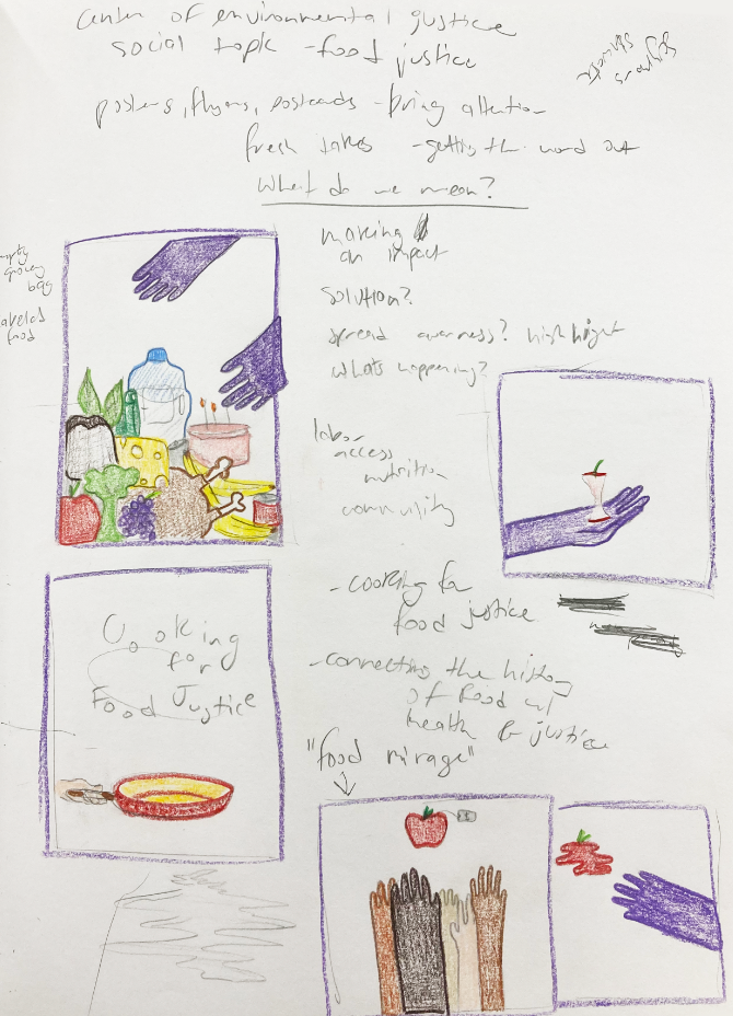
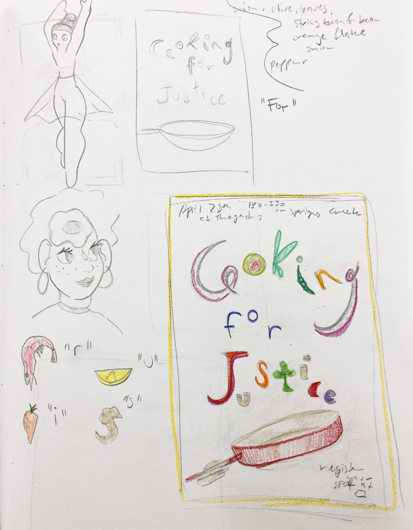
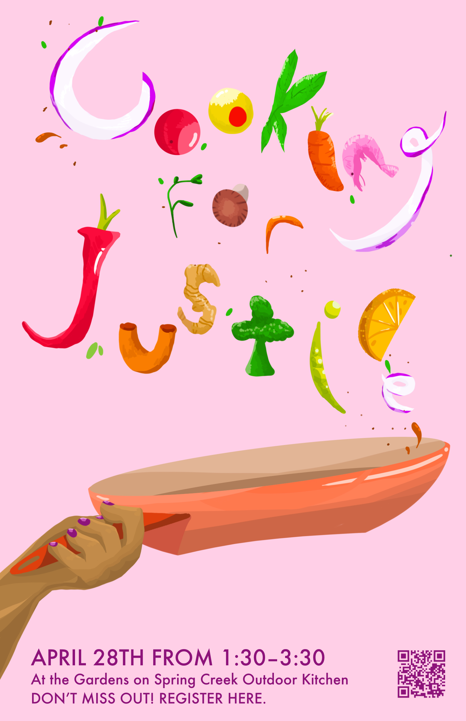
I started this project just by taking notes about what was presented for the project and also a little bit about what Mindy Hill (the program manager for Center of Environmental Justice) was looking for with these posters. I also started doodling a couple of really simple ideas. Just really basic food illustrations with little hands. I moved on after looking at the events to doodling potential posters for the events of Food Justice Week and came up with the idea of having the letters for a particular even jumping out of a pan.
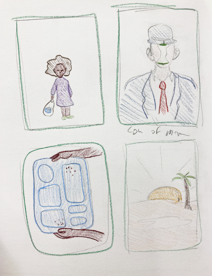
I also looked into a little research about food deserts and found a the term “food mirage” that piqued my interest. A food mirage, I learned, is a neighborhood with fresh food available - but those living in the area can’t afford it. I started thinking about how to illustrate that concept, but ended up taking the poster in a different direction. I also sketched up a couple of ideas with maybe some more impact of imagery, and also a parody of The Son of Man - which, I felt, was a little much for the concept.
I decided to develop my Cooking for Food Justice event poster a little bit more and plan out the types of foods I wanted for the letters to be - while also continuing to doodle a bit. I drew up a couple of different couple options for letters. I experimented with a little color testing as well.While planning specific foods for the letters, I tried looking into some inspiration of food photography and illustration. The food that was bright and colorful looked more enticing. In order to add that freshness of food to the poster I used a lot of bright colors.
My first draft was a little rocky, I pulled in my concept but was struggling a little bit with the colors and text for the poster. Originally I had some of the text describing the time and location for the event at the top of the poster - that was eventually moved to the bottom of the poster to let the illustration breathe a little bit. The posture of the hand was also a bit off, as well as some of the detail in the pan. I also originally had the “for” in text but changed that to match the rest of the foods.After a lot of tweaking colors and giving the hand and pan more of a painterly touch, the final posters were finish. I didn’t have to change up much when translating the poster over to sixteen by twenty. This project was really wonderful, even though the cooking for food justice event was canceled - I’m still very happy about my final product.